By Cheryl Anderson
“The first client is the horse, the second, the rider.”
Jean-Louis Dumas
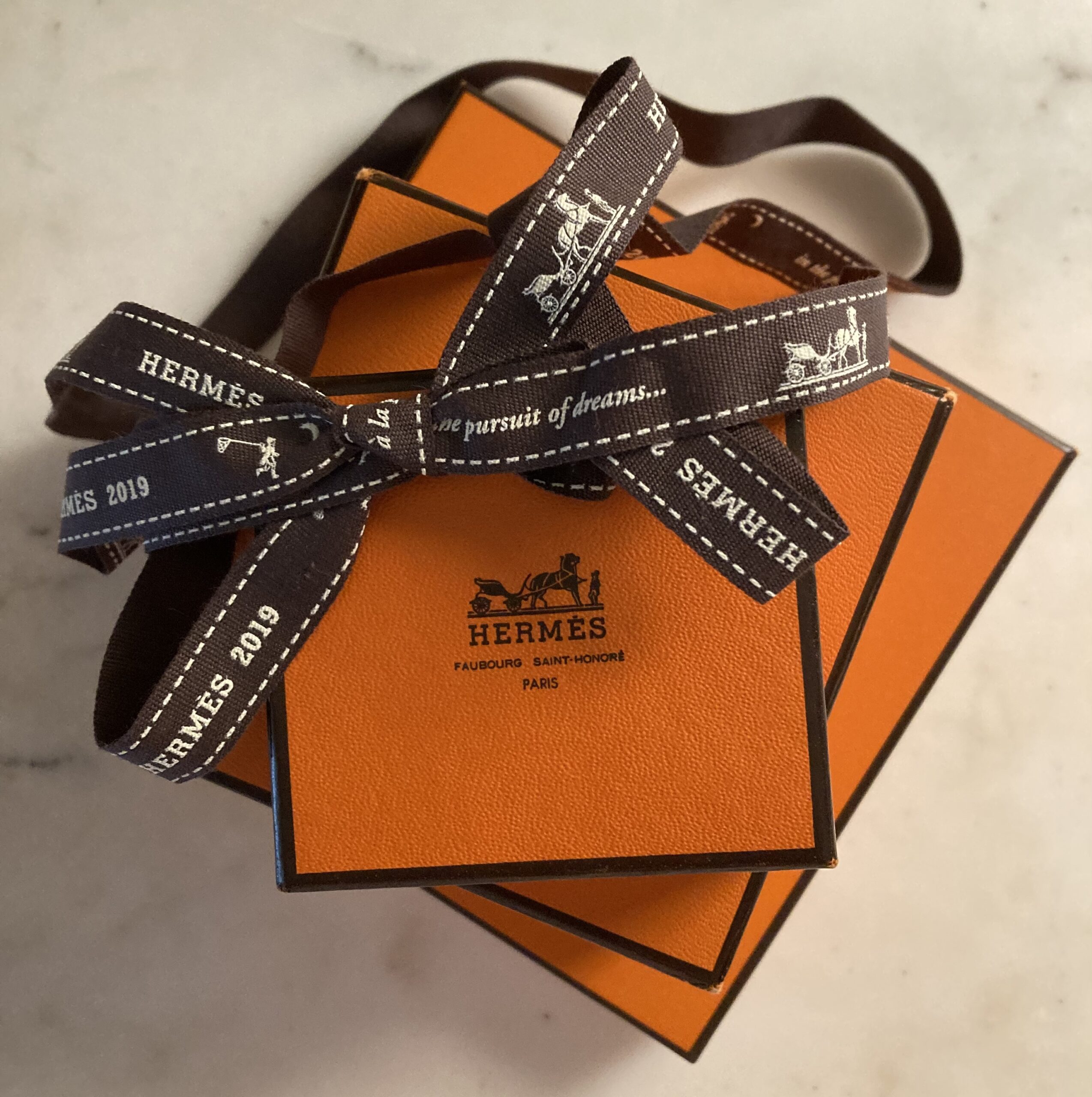
As familiar worldwide as any logo and packaging can be, is that of the House of Hermès. Instantly recognizable, is the iconic Hermès orange box with the Duc carriage, horse and groom stamped in the center of each and every lid, and appearing all along the chocolate brown Bolduc ribbon that holds the box together. The logo, as it appears today, was introduced in the early 1950s. The Hermès signature orange box with its brown edge and logo, has been with us since the 1960s. In the portfolio of Hermès colors, I read, is color code 93. The Hermès brand refers to it as Orange, Orange H or Classic Orange—it emotes great energy, is cheerful, bright, and distinctive enough without being garish.
The genesis of the logo begins with a painting, Le Duc attelé, groom à l’attente. The artist was Alfred de Dreux, noted for his equestrian portraits. The understated “pencil drawing with highlights of white and red, hung in a prominent position in the office of Émile Hermès, and it seemed a natural choice of design when this great bibliophile was designing a bookplate in 1923.”
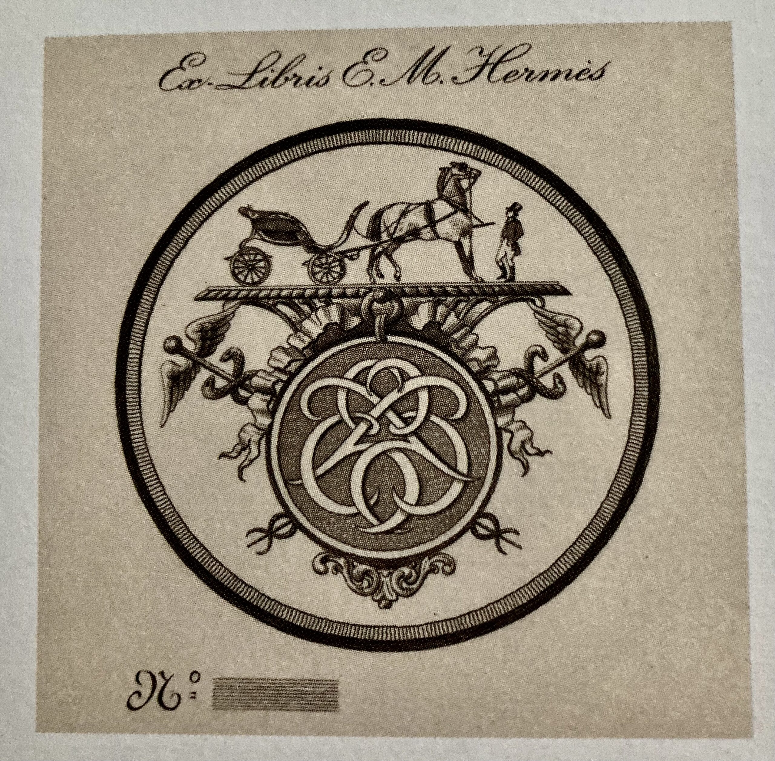
Émile Hermès’ Ex-Libris bookplate (1923).
“His uncle Henri Pannier, a decorative artist, stylized the image, placing it in a circle surmounting the interlaced letters of Hermès’s initials, and flanked on each side by a caduceus, the winged scepter that the god Hermes is reputed to have used to separate the two fighting serpents that are shown coiled around it.” The interlaced letters in the center would evolve in time into the single stylized letter H, Memphis Bold font designed by Rudolf Wolf. I was unable to find the exact date of the change to the single H.
In 1946, a simple, described as bold, scarf with the bookplate motif in the center was designed by Hugo Grygkar—le carré name, Ex-Libris. Different types of carriages surround the logo. The 1940s found Colette, the novelist, wearing the Ex-Libris scarf “as a huge bowtie.” Fifty years after her death in 2004 Richard Avedon photographed “a young man wearing the Ex-Libris scarf in the style of a corsair’s bandana.”
“The Hermès scarf is no stickler for chronology. It transcends fashion, freely mixing styles, periods and colours.”
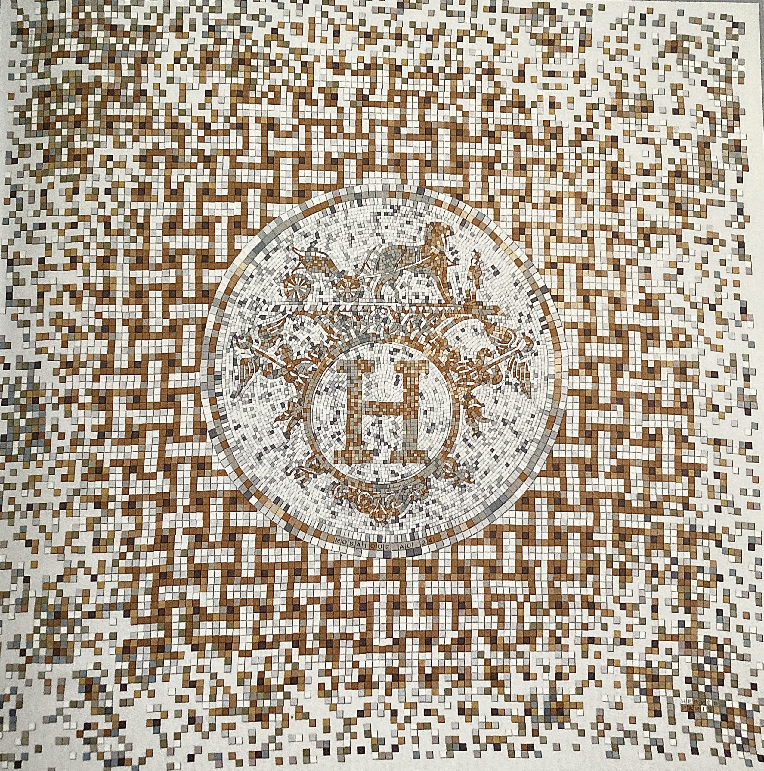
Mosaïque au 24, carré, Benoît-Pierre Emery, 2008.
The Dreux painting now hangs above a fireplace in the Hermès museum, 23 rue Boissy d’Angles, Paris. The museum is filled with Émile’s vast collection, a collection he began at age 12. I’ll talk about his collection in future postings. Some items from his collection ended up serving as the designs for les carrés de soie.
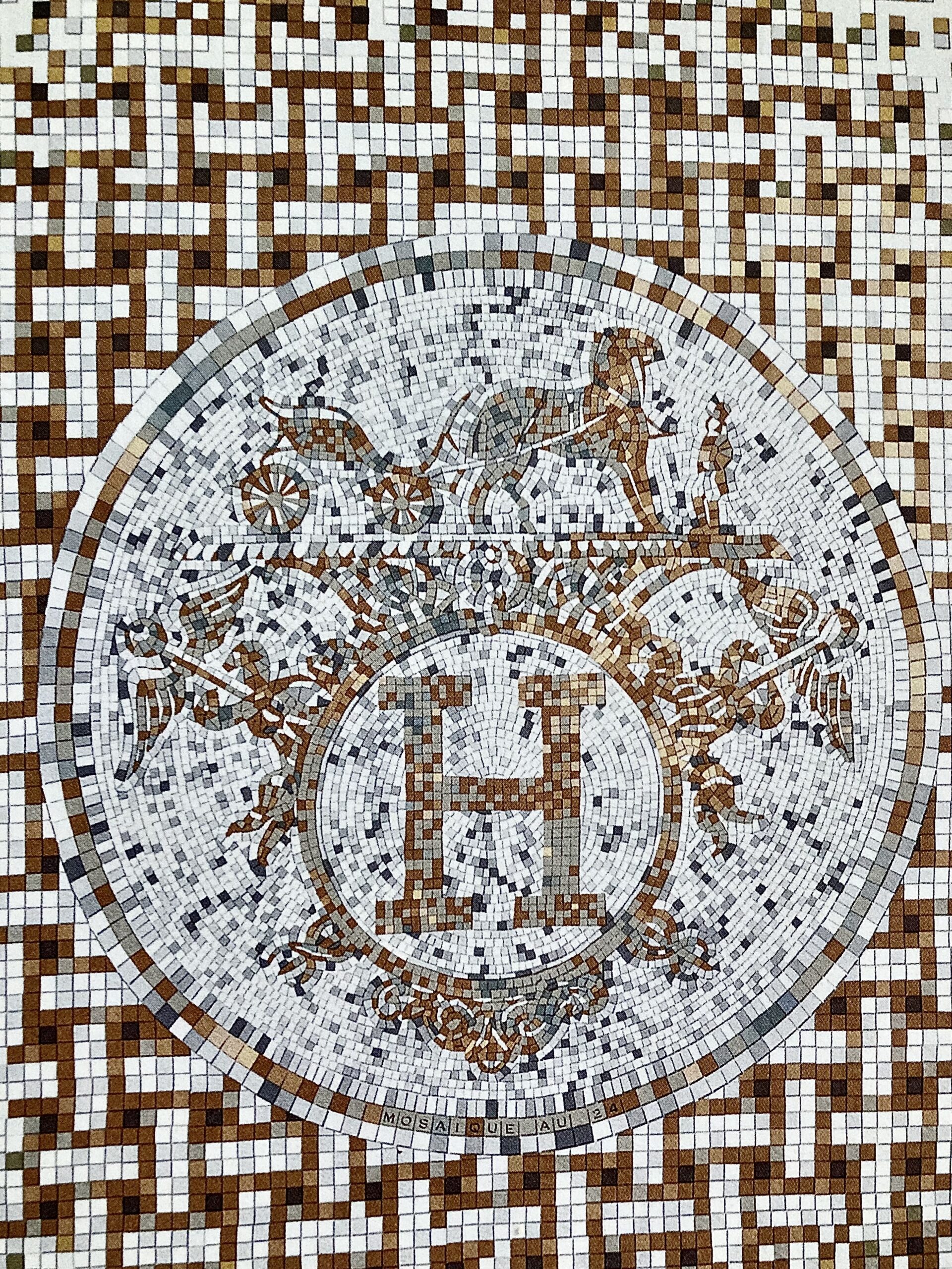
Closeup of Mosaïque au 24.
A mosaic in small yellow and white tiles of the bookplate design with the single H appears on the floor of 24 Faubourg Saint-Honoré. The scarf, Mosaïque au 24, reflects the same design created by Benoît-Pierre Émery, 2008.
 |
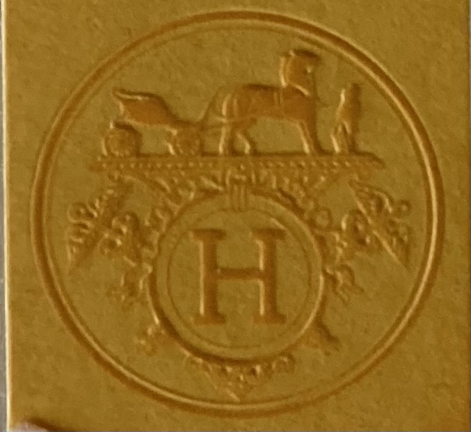 |
The importance of the Hermès logo lies in that it recalls the roots, the history of the brand, the horse is large and the groom is small. Their beginning as premier saddle and harness makers is at the core of what the House offered—it also suggested the luxury of owning a carriage and horse. The brand was always aimed at the well-to-do and aristocracy. The grave over the second ‘e’ in Hermès implies its French origins and not the Greek God Hermes.
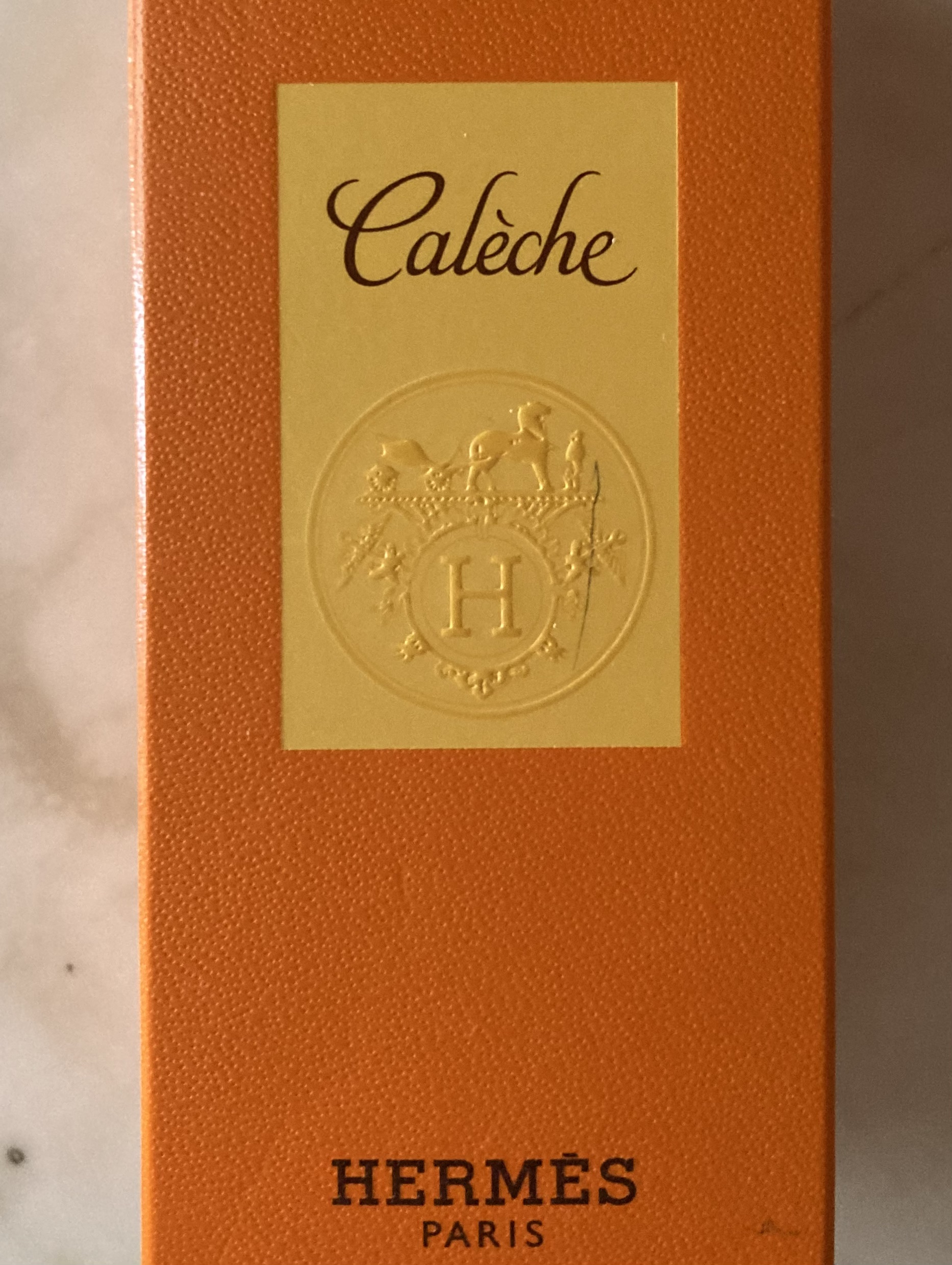
The color of the Hermès box in the 1920s was cream, a color to resemble pigskin—gilded were the edges and the logo. Then in the 1930s packaging became a mustard or marigold color with a dark brown edge and logo. World War II began in 1939. Most everything in war-torn France was impacted. By 1942, trade and transportation were greatly slowed. Cream dyes for the faux pigskin color of the Hermès boxes and marigold dyes were no longer available. Although, the cardboard for the boxes was in ample supply. Émile-Maurice Hermès’ usual supplier, having run out of the Hermès packaging stock, offered bold orange boxes—no one else wanted that color. So, what did Èmile do? He put their logo on the lid of the new orange packaging, added dark brown Bolduc ribbon to tie it together, et voila, the birth of what has become, what can only be, the Hermès orange box. Something wonderful is always under the lid of a boîte orange. Hermès of course.
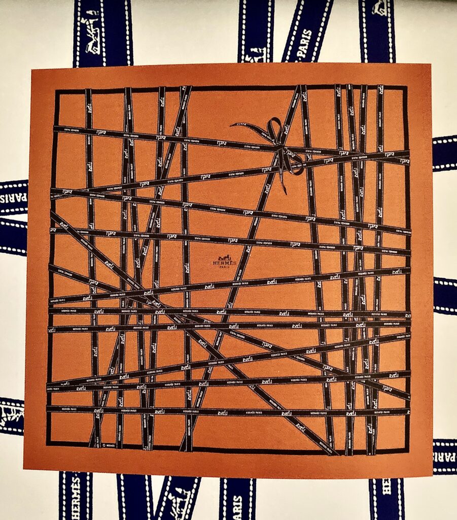
Bolduc, carré, Jean-Louis Dumas, 1983. |
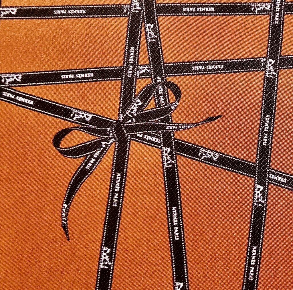
Closeup of, Bolduc, carré. |
In 1994, Hermès was given the packaging Oscar for their iconic orange box. There are about 188 box sizes—ones small enough for a little leather bracelet to a Birkin 40. One year, the orange box became heart-shaped celebrating Valentine’s Day, 2017. How delightful that must have been for the recipient that Valentine’s Day.
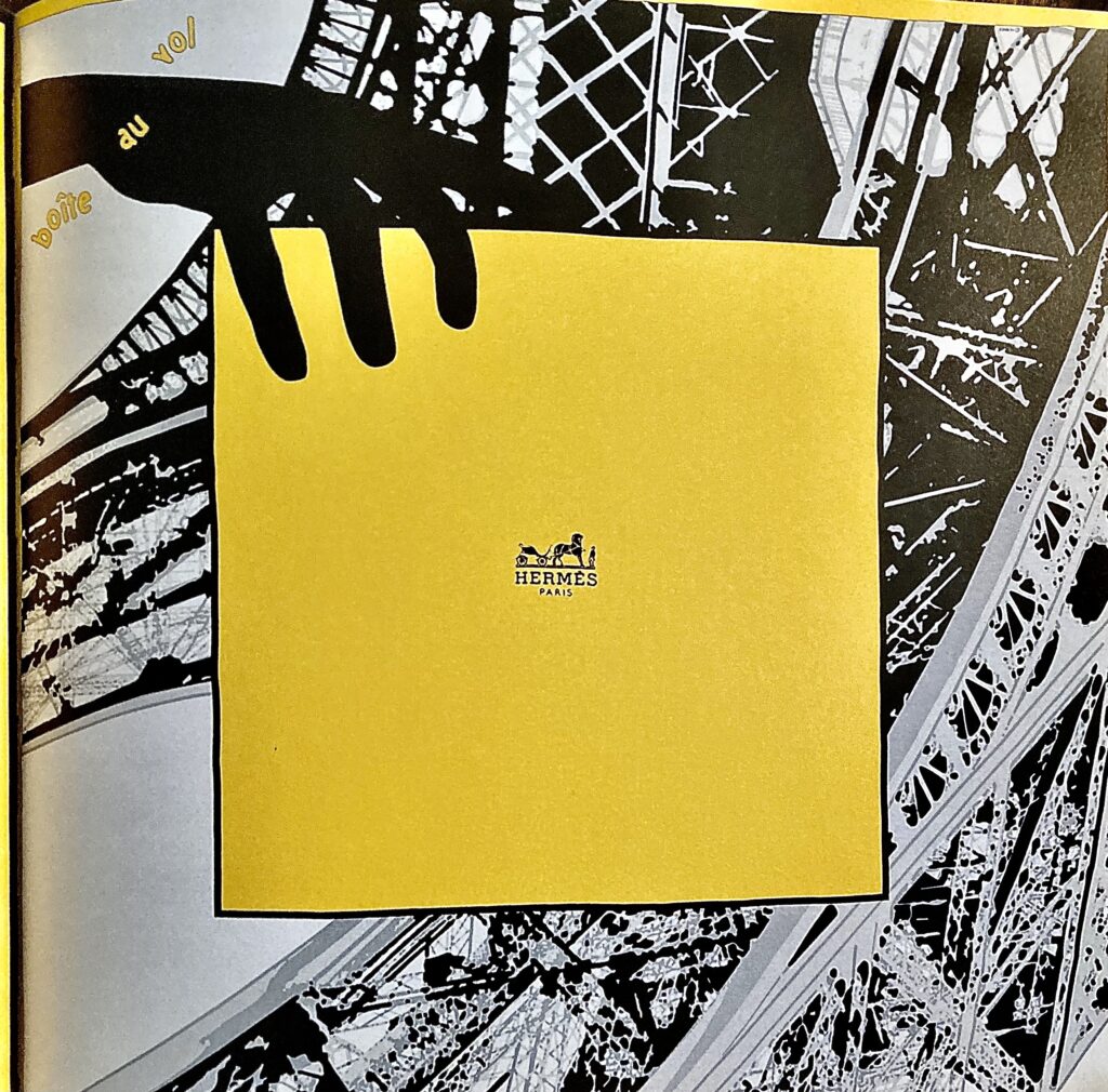
Boîte au vol, carré, Bali Barret, 2005.
Le logo, in a circle, harkening back to the bookplate, but with the H…chocolate brown Bolduc ribbon imprinted with the Duc carriage, horse and groom…and la boîte, have become the motif for a few carrés de soie. Hermès, always makes it interesting!
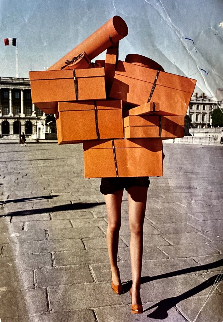
An Hermès ad from long ago I have kept. It simply caught my eye. And, now fits in with my commentary on packaging.
À bientôt
Quotes and Pictures:
The Hermès Scarf—History & Mystique, by Nadine Coleno, Thames and Hudson, publisher.
Hermès publication.


